Bravo Des Moines Color Branding
Tiger fish - final design
+ COLOR THEORY
+ COLOR PSYCHOLOGY
+ BRAND REDESIGN
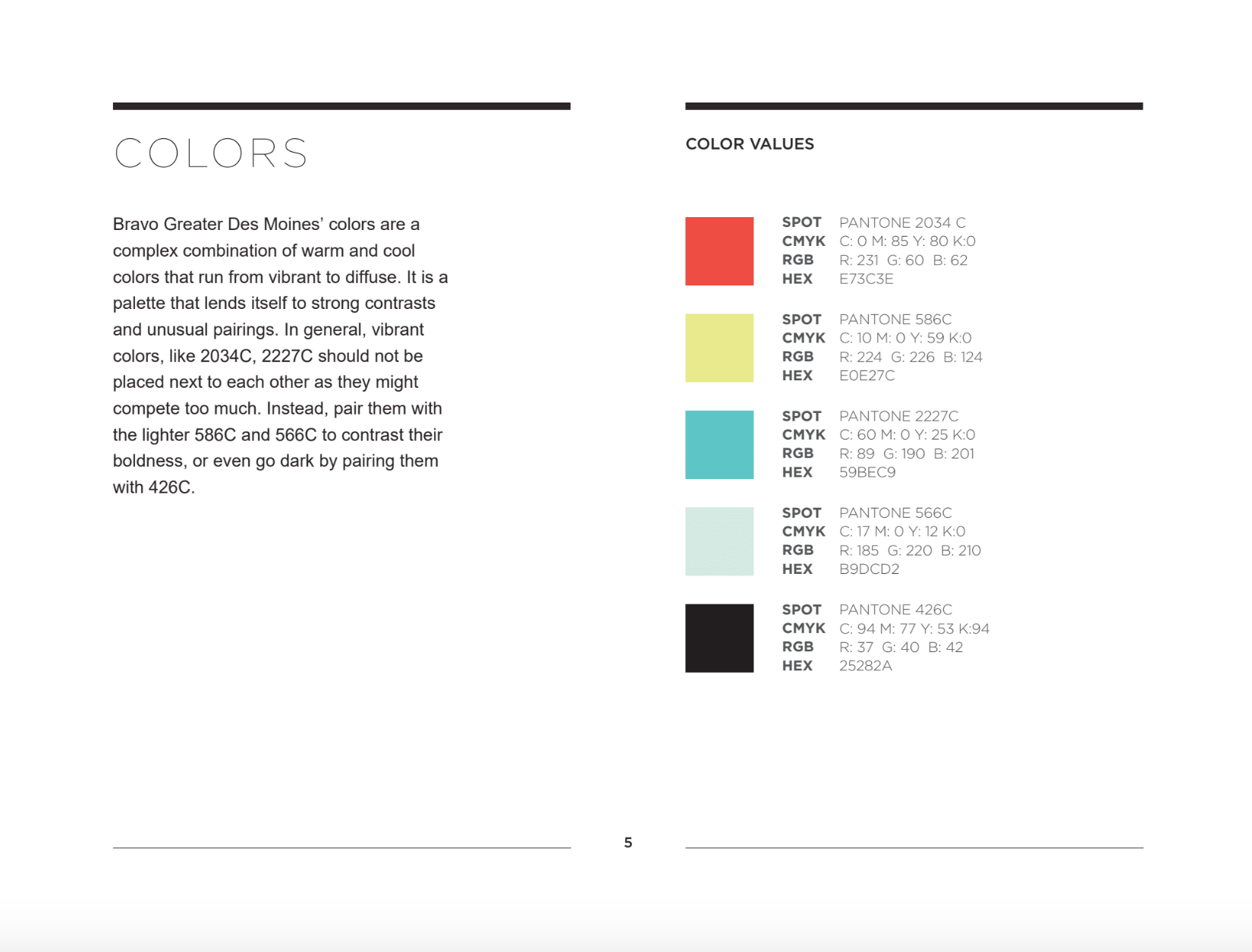
Bravo Greater Des Moines’ colors are a complex combination of warm and cool colors that run from vibrant to diffuse. It is a palette that lends itself to strong contrasts and unusual pairings.
When Bravo Greater Des Moines went through a brand identity change in spring of 2016, they wanted a color palette for their new logo. Through a process of careful consideration of company values, potential uses in digital and print, and integrity of brand, 8 color palettes were proposed for Bravo Greater Des Moines.
Color theory was utilized to come up with 8 color palettes: Tiger Fish, Ceviche, Elemental, Rainbow Trout, Retro Fizz, Vintage Kitchen, and White Sangria. Each were carefully crafted using principles of color theory and balance to create a playful, bright and beautiful depiction.
*Color scheme crafted by Gabrielle Gaass. Design created by Doug Choi. Work attributed to Happy Medium Des Moines. Logo owned by Bravo Des Moines.*


